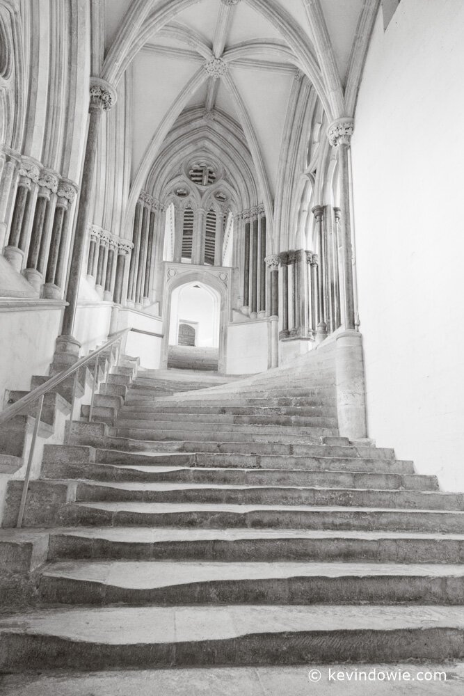
I pondered the title of today’s post for some time. The wearing down of the stone steps by so many feet over so many years, the religious connotations of ascending towards the light, etc. In the end, I went with the unimaginative and strictly descriptive….(insert shrugging shoulders emoji!)
Going Monochrome
There were numerous decisions to be made with the image processing. I did both colour and monochrome versions, I think the subject lends itself well to black and white. I also decided to go for an overall light image, few if any true blacks here. Finally, I went with a very subtle sepia toning. Indeed, so subtle is my current use of tonings that some people who’ve recently seen my black and white images innocently ask if I considered using a sepia toning or effect. I receive such questions with a certain sense of satisfaction!
My feeling about the use of specific processing techniques is that if the technique, be it a toning, a vignette, a localized adjustment, etc, is immediately obvious, then it’s probably too heavily applied. The exception to this is, of course, where the effect is a key element of the image and used deliberately. An example of this is my previous post “History and the milling crowd”. The image uses multiple exposures blended and layered, indeed the technique is crucial to the image conceptually. It’s intent rather than carelessness.
 The well-worn steps of the stairway to Chapter House, Wells Cathedral, England.
From the Britain image gallery. ~KD.
