Re-evaluating a Photograph
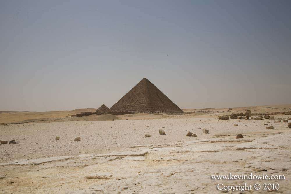
Going back through my archives, I’ve revisited an image that I compiled back in 2007. The image was of some of the pyramids at Giza in Egypt. I say compiled because the image is a composite of three images of the same scene taken a few minutes apart and then digitally blended in Photoshop to give the effect that I wanted. The reason for this is that there were some distractions moving through the scene that I wished to remove. A couple of motor vehicles moving along a track in the distance and then a couple of tourists who decided to stand in the foreground of my shot (damned inconsiderate!).

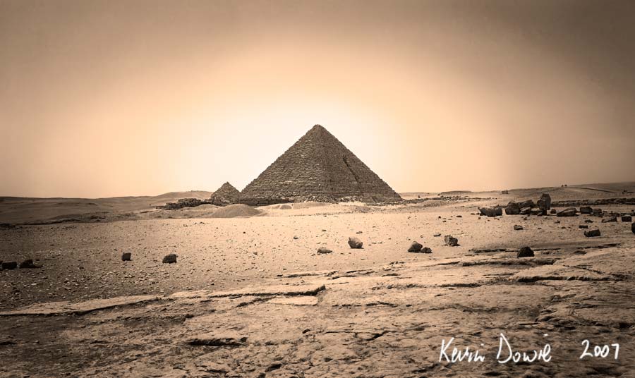
With the images combined, I was able to mask out the vehicles in the background and the tourists in the foreground. I decided that I would present the image as a toned black and white which I thought was in keeping with the historic “timeless” nature of the location.

The vehicles and people in brightly coloured tee shirts just didn’t belong in my view. (I combined 3 images in total but have not shown the 3rd shot, as at this magnification the differences to image 2 aren’t obvious)

Changing views about image processing
In my original presentation of the image back in 2007, (reproduced here) I converted the image to black and white, increased the contrast in the sky and foreground and in particular the pyramids themselves. I then created a dodge and burn layer to lighten the centre, in particular, the pyramids (the dodging) and darkened the edges of the frame (the burn) to give a vignette effect. The toning effect that I used in the 2007 version of this image was what you may call a brown toning effect. At that time it reflected the way that I wished to present the image, and was what I felt was most appropriate.
Historical influences
I’d seen numerous historical photographs taken in the 19th century by such people as John Thomson and Roger Fenton and was influenced by them in my choice of processing.
I guess it says something about how our ideas and tastes change, evolve maybe, that when I went back to this image, I wished to change it. Whether the 2010 version (maybe for the computer geeks I should call it version 2.0!) is better or not really is a matter of opinion.

So which version is best? As I said before, purely a matter of personal taste but I guess it shows the value of revisiting some of our earlier photographs and reassessing them in light of our evolving thoughts, feelings and dare I say it, our evolving personal vision.
