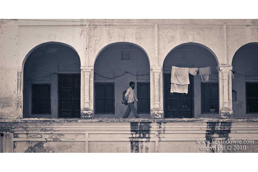
Taken in Haridwar, India. A man walks along the archway supported balcony of a building. I was drawn to the repeated geometry of the arches and waited for a human figure to enter the frame.
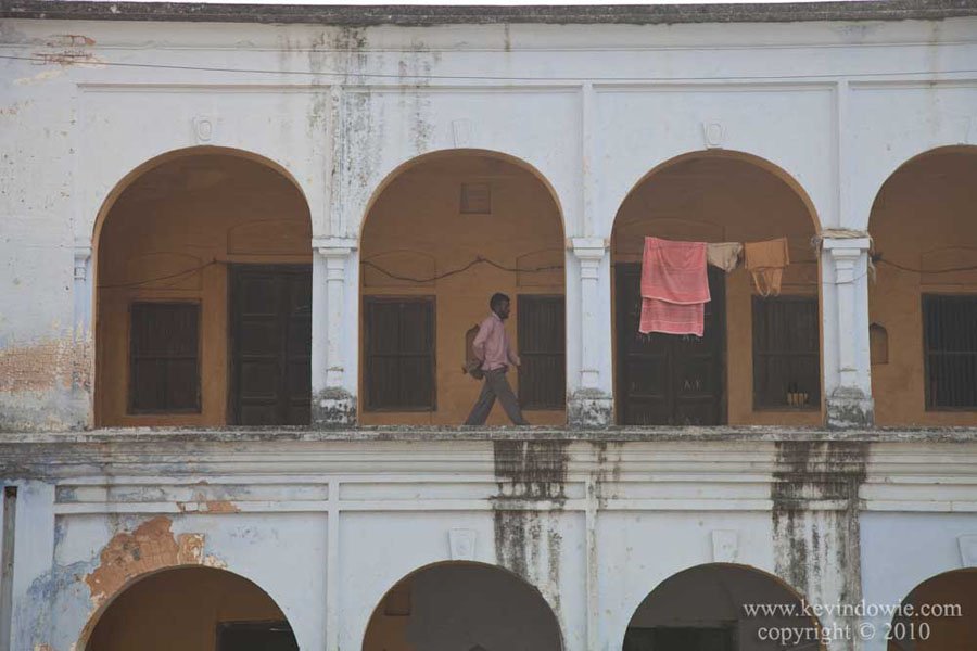
In processing the image, I considered both colour and black and white versions and settled on the toned black and white treatment. The original image, which can be seen at the foot of this post, lacked contrast and showed some lens distortion as well.
Image processing using Lightroom
Lens correction–
Virtually all lenses, no matter how well designed, display some form of distortion. Under the “Lens Corrections” tab in Lightroom, adjustments can be made individually to distortion (linear distortion), chromatic aberration and vignetting. One of Lightroom’s cool features is that it uses the Exif data from the image file to recognize what lens was used and at what focal length and provides a profile for that specific combination. Checking the “Enable Profile Corrections” tab means that Lightroom applies the profiled corrections without any fuss. My own findings are that the profiled corrections are so good that it’s virtually pointless tweaking the individual values.
Increase contrast–
The original image was flat, the histogram was narrow showing that there were no values in the file that approached either pure black or pure white. Under the “Basic” adjustments tab, I stretched out the histogram by increasing the exposure (by about half a stop) to brighten the overall image, and then moved the black point slider well up so that the darkest shadows in the image were closer to true black.
Crop–
A matter of personal preference, but I decided I didn’t need the stuff at the very top and very bottom of the image so cropped it into a more “panoramic” image format. Some people get really pedantic about cropping, there are those of the “never crop, preserve the ‘integrity of the frame’” school of thought. I’ve expressed my views on this before but I’ll do it again, I consider that view to be absolute nonsense. I wonder how much time those people spend in front of a mirror each morning excessively combing their hair.
Black and white conversion–
Under the “B & W” tab you can adjust the “black and white mix” by lightening or darkening the individual underlying colours in the image. For example, that towel is predominately red in colour so by lightening the red values, the towel is lighter in tone in the final black and white rendering of the image. In this image, I lightened the red values and darkened the blues.
Split toning–
I personally like some of the split toning effects that can be achieved, they can lift a simple monochrome image. Split toning was achieved in the traditional darkroom by processing the print through different chemical baths for specific amounts of time to get different development to the highlight and shadow areas of the print. This meant that a colour contrast could be introduced between light and dark areas in the print. Lightroom mimics this effect. I used a warm (yellowish) toning in the highlights and a cool (bluish) toning in the shadows. My practice is to set the saturation levels to 50% whilst experimenting with the actual hue values which gives an exaggerated “over the top” result. Once I’m satisfied with the split-tone colour combination, I then back the saturation right back so as to give a subtle effect. To me, if the viewer looks at the image and isn’t immediately aware of the effect used then that’s right. If an image screams out “special effects” then, to me, it’s a failure.
Vignette–
Found under the “Effects” tab. I try and keep this really subtle for the same reasons explained above. I tend to use this in “paint overlay” mode.
Sharpening–
Found under the “Detail” tab, I increased the sharpening amount above the default value.

The original, unprocessed image is posted below for comparison.

